

Table of contents
- Table of Content
- Why we need Media Query?
- What is Media Query?
- Media Query Syntax
- Types of media types:
- Predefined (Common) Breakpoints
- List of Expressions used in Media Query
- Example - Single Break-point
- Example - Multiple Break-points
- Example - Without Media Type (Default - ALL)
- Example - Using Orientation (landscape/portrait)
In this guide, We are going to Learn Media Query in CSS Which is important topic for Today’s world. Because more than 50% users use Mobile phones to Visit websites. So There is no reason to not learn Media Query. Let’s dive into Media Query.
Table of Content
Why we need Media Query?
What is Media Query?
Media Query Syntax Media Types
Common Breakpoints
Expressions (Media Features)
Examples
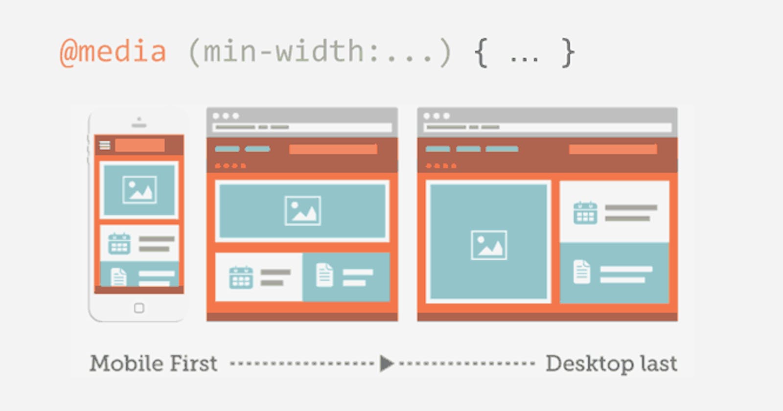
Why we need Media Query?
As I told you before, Nowadays more than 50% users use mobile phones and Tablets for visiting websites.
If you create any website using HTML and CSS then you probably made for desktop devices or laptops.
Now decrease your browser width and Check how your website looks for mobile phones and Tablets.
99% times you need to make your website works for Mobile devices and Desktops. So that’s why we need Media Queries.
What is Media Query?
Media Queries are used to provide different styles for different devices by their features like width, height, orientation etc.
By using Media Queries, we can create web pages looks great on desktop as well as mobile phones and tablets. and we call these websites Responsive websites.
For example, Facebook website, Instagram website, YouTube website are Responsive websites because they looks different according to device features.
So to create responsive design we use Media Query in CSS.
Media Query Syntax
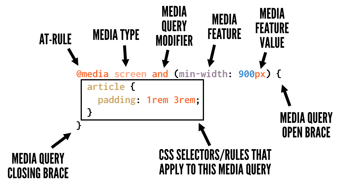
Types of media types:
Screen - for screen devices like desktops, tables, mobile phones
Print - for printers (When we print the page by using CTRL + P)
Speech - for Screen-readers which Read screen for disable peoples
ALL (Default) - for All types of media types.
Predefined (Common) Breakpoints
Mobile: 360 x 640
Mobile: 375 x 667
Mobile: 360 x 720
iPhone X: 375 x 812
Pixel 2: 411 x 731
Tablet: 768 x 1024
Laptop: 1366 x 768
High-res laptop or desktop: 1920 x 1080
List of Expressions used in Media Query
Feature
width Defines the widths of the viewport. This can be a specific number (Like 667px) or a range (using min-width and max-width ).
height Defines the height of the viewport. This can be a specific number (Like 667px) or a range (using min-height and max-height ).
aspect-ratio Defines the width-to-height aspect ratio of the viewport (Like 4/3, 3/4, 16/9, 9/16)
Orientation The way the screen is oriented, such as tall ( portrait ) or wide ( landscape ) based on how the device is rotated.
Example - Single Break-point
@media screen and (min-width: 768px)
{
.container { display: flex; }
.box_1 { background-color: dodgerblue; color: white; }
}
Example - Multiple Break-points
@media screen and (min-width: 768px) and/or (max-width: 1080px)
{
.container { display: flex;
}
.box_1
{
background-color: dodgerblue;
color: white;
}
}
Example - Without Media Type (Default - ALL)
@media (min-width: 768px)
{
.container {
display: flex;
}
.box_1
{
background-color: dodgerblue;
color: white;
}
}
Example - Using Orientation (landscape/portrait)
@media screen and (orientation: landscape)
{
.container
{
display: flex;
}
.box_1 {
background-color: dodgerblue;
color: white;
}