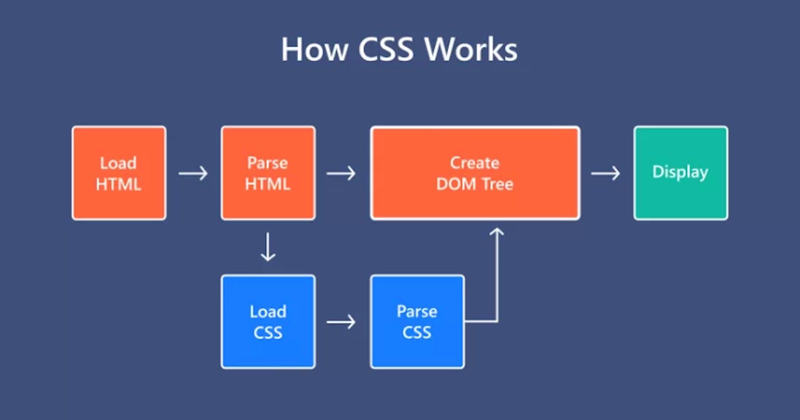


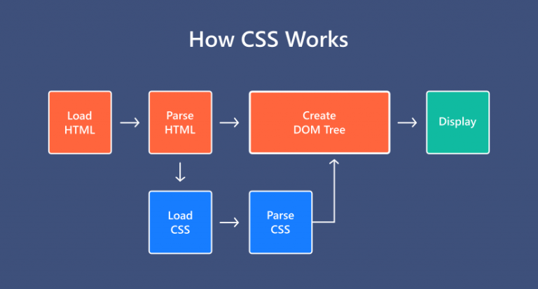
Cascading Style Sheets (CSS) is a stylesheet language used to describe the presentation of a document written in HTML or XML (including XML dialects such as SVG, MathML or XHTML). CSS describes how elements should be rendered on screen, on paper, in speech, or on other media.
CSS is among the core languages of the open web and is standardized across Web browsers according to W3C specifications. Previously, the development of various parts of CSS specification was done synchronously, which allowed the versioning of the latest recommendations. You might have heard about CSS1, CSS2.1, or even CSS3. There will never be a CSS3 or a CSS4; rather, everything is now CSS without a version number.
After CSS 2.1, the scope of the specification increased significantly and the progress on different CSS modules started to differ so much, that it became more effective to develop and release recommendations separately per module. Instead of versioning the CSS specification, W3C now periodically takes a snapshot of the latest stable state of the CSS specification and individual modules progress. CSS modules now have version numbers, or levels, such as CSS Color Module Level 5.
Cascading Style Sheets (CSS) is a stylesheet language used to describe the presentation of a document written in HTML or XML. CSS allows you to control the layout, style, and appearance of elements on a web page. Let's explore CSS in more detail:

1. CSS Syntax:
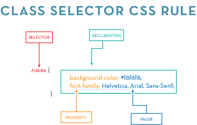
CSS is written in a syntax that consists of a selector and a declaration block:
selector {
    property: value;
}
Selector: Targets HTML elements that you want to style.
Property: Specifies the style attribute you want to change.
Value: Assigns a value to the property.
2. Selectors:
Selectors are patterns that match one or more HTML elements. Here are some examples:
Type Selector:
  p {
      color: blue;
  }
Class Selector:
  .myClass {
      font-size: 16px;
  }
ID Selector:
  #myID {
      background-color: #f0f0f0;
  }
Attribute Selector:
  input[type="text"] {
      border: 1px solid #ccc;
  }
3. CSS Properties:
CSS properties define the visual style of an element. Here are some common properties:
Color:
  h1 {
      color: red;
  }
Font:
  body {
      font-family: 'Arial', sans-serif;
      font-size: 16px;
      font-weight: bold;
  }
Margin and Padding:
  div {
      margin: 10px;
      padding: 5px;
  }
Border:
  img {
      border: 1px solid #333;
  }
Background:
  body {
      background-color: #f5f5f5;
  }
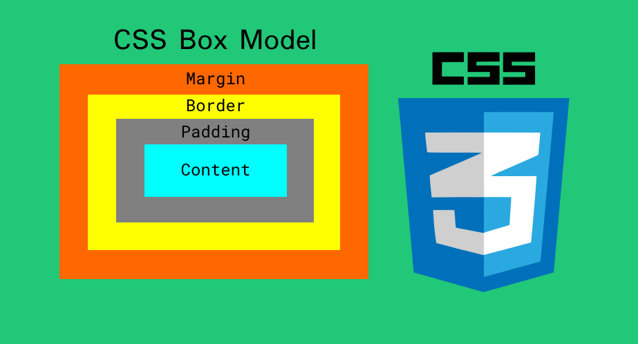
4. Box Model:
The CSS box model describes the layout of elements on a page. It consists of content, padding, border, and margin:
div {
    width: 200px;
    padding: 20px;
    border: 1px solid #ccc;
    margin: 10px;
}
Content: The actual content of the element.
Padding: The space between the content and the border.
Border: The border surrounding the padding.
Margin: The space outside the border.
5. Flexbox and Grid Layout:
CSS provides powerful layout models like Flexbox and Grid for creating responsive and flexible designs.
Flexbox:
  .flex-container {
      display: flex;
      justify-content: space-between;
      align-items: center;
  }
Grid:
  .grid-container {
      display: grid;
      grid-template-columns: repeat(3, 1fr);
      grid-gap: 10px;
  }
6. Transitions and Animations:
CSS allows you to add transitions and animations to create dynamic and interactive elements.
Transitions:
  button {
      transition: background-color 0.3s ease-in-out;
  }
Animations:
  @keyframes slide {
      from {
          transform: translateX(-100%);
      }
      to {
          transform: translateX(0);
      }
  }

  .slide-in {
      animation: slide 1s ease-in-out;
  }
7. Media Queries:
Media queries enable you to apply different styles based on the characteristics of the device or browser.
@media screen and (max-width: 600px) {
    body {
        font-size: 14px;
    }
}
This is just a brief overview of CSS, and there is much more to explore, including advanced techniques, preprocessors (like Sass or Less), and postprocessors. Understanding CSS is crucial for creating visually appealing and responsive web pages. Combining HTML, CSS, and JavaScript allows you to build rich and interactive user interfaces on the web.
Let's dive deeper into some specific aspects of CSS:
1. CSS Units:
CSS uses different units for specifying lengths and sizes:
Absolute Units:
px(pixels): A fixed-size unit.pt(points): Commonly used for print styles.in,cm,mm: Inches, centimeters, and millimeters.
Relative Units:
%: Percentage relative to the parent element.em: Relative to the font-size of the element.rem: Relative to the font-size of the root element.vw,vh: Relative to the viewport width and height.
div {
    width: 200px;
    font-size: 1.2em;
    margin: 2rem;
}
2. CSS Box Sizing:
The box-sizing property controls how the total width and height of an element are calculated:
.box {
    box-sizing: border-box;
    width: 200px;
    padding: 20px;
    border: 5px solid #333;
}
content-box(default): Width and height only include the content.border-box: Width and height include content, padding, and border.
3. CSS Positioning:
CSS offers different positioning schemes:
static(default): Elements are positioned according to the normal flow of the document.relative: Element is positioned relative to its normal position.absolute: Element is positioned relative to its closest positioned ancestor.fixed: Element is positioned relative to the viewport.sticky: Element is positioned based on the user's scroll position.
#relativeBox {
    position: relative;
    top: 20px;
    left: 30px;
}

#fixedBox {
    position: fixed;
    top: 0;
    right: 0;
}
4. CSS Flexbox:
Flexbox is a one-dimensional layout method for laying out items in rows or columns. It provides an efficient way to distribute space:
.container {
    display: flex;
    justify-content: space-between;
    align-items: center;
}
flex-direction: Defines the direction of the main axis.justify-content: Aligns items along the main axis.align-items: Aligns items along the cross axis.
5. CSS Grid:
CSS Grid is a two-dimensional layout system for building grid-based layouts:
.grid-container {
    display: grid;
    grid-template-columns: 1fr 2fr 1fr;
    grid-gap: 10px;
}
grid-template-columns,grid-template-rows: Defines the columns and rows of the grid.grid-gap: Sets the gap between grid items.
6. CSS Transitions and Animations:
Transitions and animations can add interactivity and visual appeal:
.button {
    transition: background-color 0.3s ease-in-out;
}

@keyframes fadeIn {
    from {
        opacity: 0;
    }
    to {
        opacity: 1;
    }
}

.fade-in-element {
    animation: fadeIn 1s ease-in-out;
}
7. CSS Media Queries:
Media queries allow you to apply styles based on the characteristics of the device:
@media screen and (max-width: 768px) {
    /* Styles for screens smaller than 768px */
    body {
        font-size: 14px;
    }
}
8. CSS Variables:
CSS variables allow you to store and reuse values throughout your stylesheet:
:root {
    --main-color: #3498db;
}

body {
    color: var(--main-color);
}
These are just a few additional details to help you understand more about specific features and techniques in CSS. The language is extensive, and mastering these concepts will empower you to create sophisticated and responsive web designs. Consider experimenting with these features in a practical context to reinforce your learning.